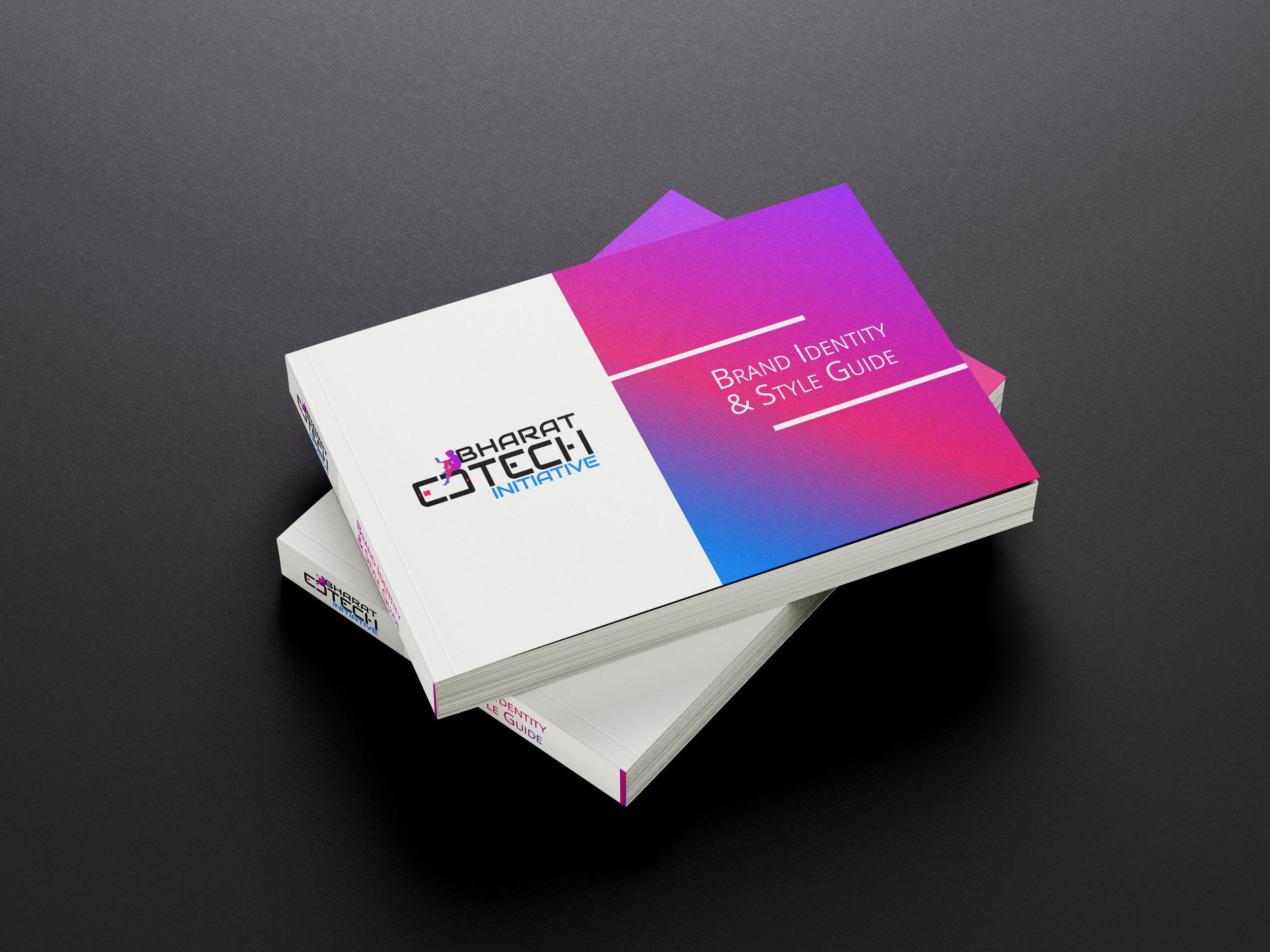
BEI Logo Design & Branding
We reimagined the logo including the end user & the device that would facilitate it, instead of a generic logo text & colour. We wanted the ultimate consumer to identify themselves & their experience in the logo. Bharat Edtech Initiative is focused on catalysing improved learning outcomes for first generation digital learners through personalised and adaptive EdTech solutions. Bharat Edtech Initiative is focused on mobilising a digital learning ecosystem to positively impact the improvement of learning outcomes.
The logo features a stylized silhouette of a child holding a tab sitting casually, symbolizing the end user. This silhouette’s posture is also indicative of how the end user will be interacting with the device, indicating integration and connectivity of technology in their life.
The Graphic & Color Palette
The child is sitting casually on a typo based graphic using the 'E' & 'D', made to look like a tab.
The colours are used to echo the core characteristics of the brand. In color theory, black represents neutrality and balance, embodying a sense of depth, sophistication, and authority. Sky blue is usually associated with dreams, and hopes while also linking it to divinity and accessibility.
The silhouette in a blue to purple vignette is representative of the enrichment that knowledge is enabling in the child.
Little pops of Fuschia to bring out a bit of play and excitement, just like the learning is intended to be.
The GS Impact
Bharat EdTech Initiative was launched with the idea of empowering children with uninterrupted access to knowledge, to ensure equitable education access across India, no matter where the child was located. The first logo of BEI lacked the strength of the story behind it
BEI focused on empowering marginalised children by scaling up EdTech solutions by partnering with EdTech giants and on-ground volunteers to devise educational programs that were more feasible and accessible for the child regardless of the family circumstance.
Gnothi Seauton supported this initiative by remastering a logo, look and feel and building a factual story on the challenges and its impact, from rebranding to purposeful storytelling.


